The Brief
K.M. Pritchard writes time-slip romance. Her first book, A Dance Through Time, was out on Amazon and the second was being written. Her readers were scattered across Amazon, Goodreads, Substack and Instagram, and not one of those places belonged to her. She wanted somewhere of her own to point people to from the back of a book: a page that explains the series, tells you where to buy it, and gets readers on a list before the next one lands.
This is about as far from a local trades site as our work goes. Nobody is searching for her on a map, and there is no quote form to fill in. A reader arrives already curious, and the whole job is holding that for thirty seconds. Same standards as every other site we build, a completely different brief.
What We Built
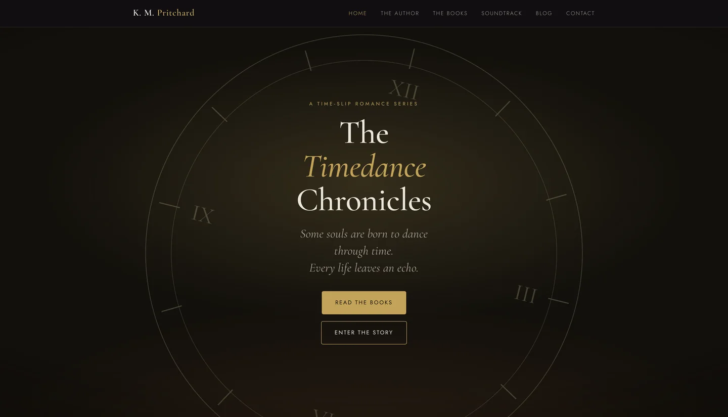
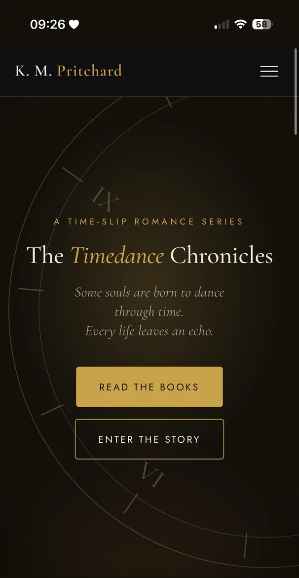
Home, The Author, The Books, Soundtrack, Blog and Contact. The site opens on a slow clock sweep and one line, “What if the past held the key to the future?”, before the series title settles inside a turning clock face. It plays once per visit rather than every time you change page, so it never wears out its welcome.
The blog was the part she was most worried about. She writes on Substack and did not want to write everything twice, so we built the site to fetch her posts on its own. She publishes on Substack as she always has, and the post appears on her own site within the hour, laid out in her own design with none of the newsletter clutter. Readers stay with her instead of being handed off somewhere else.
The Soundtrack page is the one nobody asks for and everybody remembers. Each book gets its own playlist, and for the book that is out there is a track listed against every chapter.
The Design
The brief here was atmosphere, so the colours do most of the work. The base is a warm brown-black rather than flat black, gold is saved for the things that actually matter, and the writing sits on a soft parchment tone instead of white so no page reads like a spreadsheet. One extra colour, an ember red, appears only around Book Two, which lets the newer book feel different without needing a design of its own.
Headings are set in Cormorant Garamond and the text in Jost, both served from her own site rather than Google’s, which loads quicker and means her readers are not logged by anyone else on the way in. The turning clock carries the series through everything: it is the first thing you see, it is the icon in the browser tab, and it is the thing readers remember.
The Launch
We bought and set up the domain, got the security certificate live, and put the site out the same day. Every link already shared still goes where it should, search engines were handed a full list of her pages, and a mistyped address lands on a proper page in her own design rather than a browser error.
Some projects are a campaign. This one was a build. It went out finished rather than as a starting point, and what we do from here is keep it hosted and make changes when needed.
 AI Takes Axion
AI-powered systems that help service businesses capture more leads, convert faster, and scale without the overhead.